Syntracts Rebrand — Case Study
Brand Strategy & Operational Leadership

Syntracts
Rebrand

From law-firm aesthetic to tech-forward intelligence platform — repositioning a seed-stage AI legal company for its next stage of growth.

Company Syntracts
Role Chief of Staff
Year 2025–2026
Scope Brand Strategy, Vendor Management, GTM

A product that outgrew its brand

Syntracts had built a genuinely differentiated AI platform — deterministic, not stochastic; purpose-built SLMs trained on legal data; enterprise-grade security. But its visual identity said "Big Law software," not "verification-first intelligence platform." Closing that gap was the opportunity.

>95%
Extraction accuracy — the product's core differentiator that the brand wasn't communicating
5
Design rounds managed from brief through final delivery and site launch
0
Third-party APIs or documents leaving the client environment — a trust story the brand needed to tell
Full
System: mark, lockup, color, type, icons, web, decks, print, app icon

Same product.
Different story.

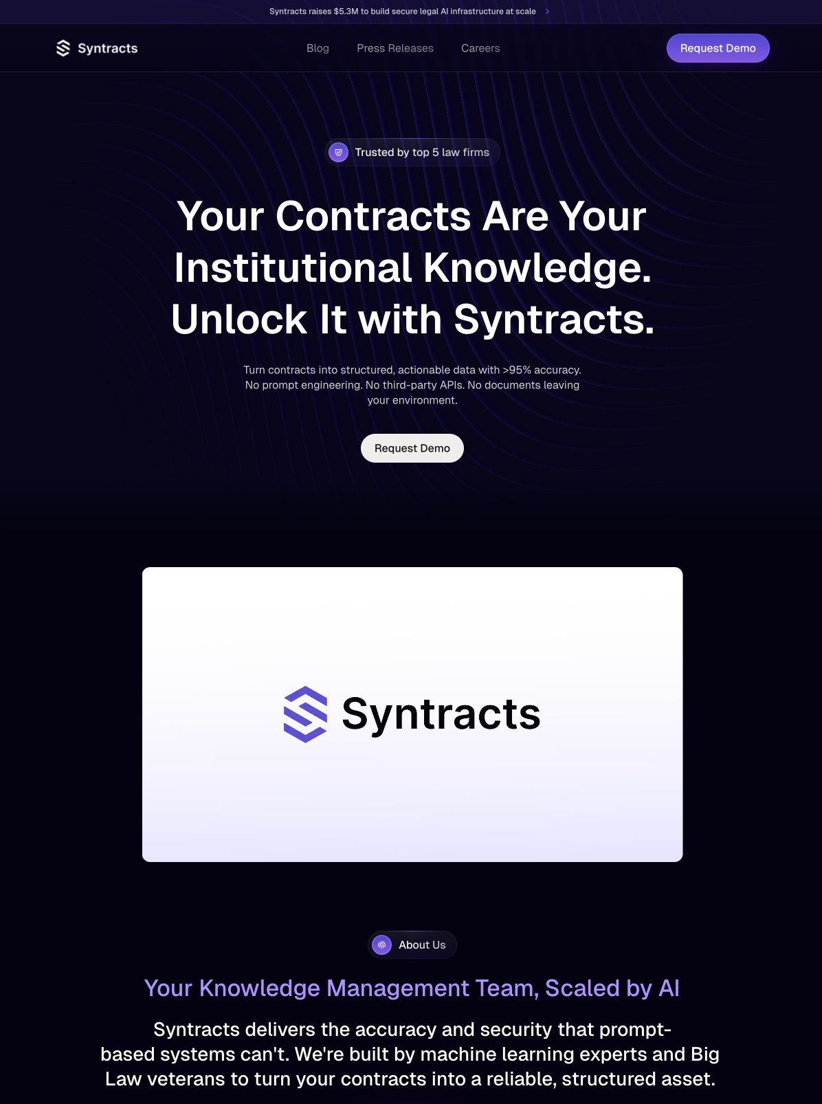
Before Dark navy — law-firm aesthetic
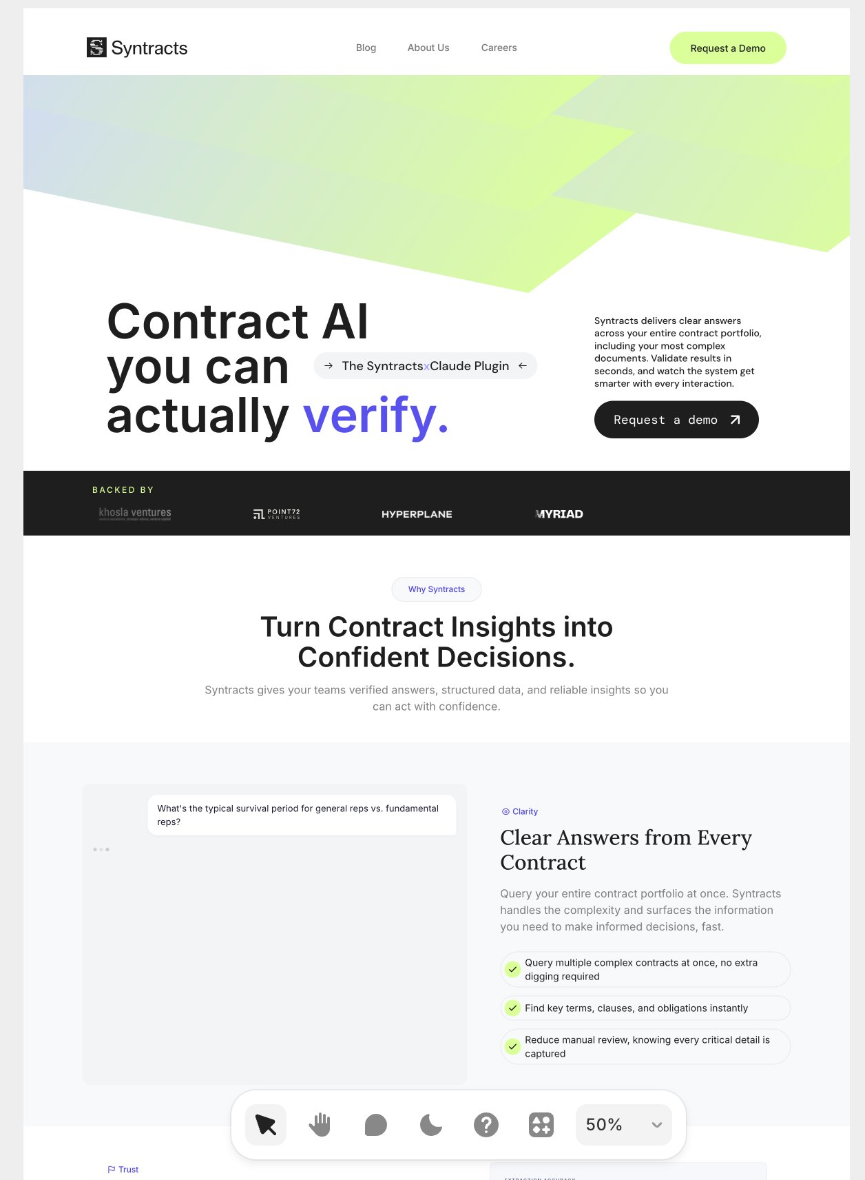
After White + lime — tech-forward platform
Syntracts before rebrand
Syntracts after rebrand
The Mark

Old logo vs. new logo.

Before
Old Syntracts logo

Abstract hexagon S — geometric but disconnected from the product mission

After
New Syntracts logo

Document-bar S — built from the visual language of contracts themselves. Ownable, mission-connected, instantly readable.

Every element, intentionally.

01
Positioning
Law-first, Big Law aesthetic
Scientist-founded verification platform
02
Color System
Enterprise purple + dark navy
White, lime, purple, black — technical precision
03
Logo Mark
Old logo New logo
Abstract S — low recognition
Document-bar S — ownable, mission-connected
04
Typography
Italic serif — feels like a law firm
Neue Haas Grotesk + Saans Mono — modern, technical
05
Messaging
"Unlock It with Syntracts"
"Contract AI you can actually verify."
06
Overall Tone
Legal software
Technical intelligence — modern, precise, human
White
Lime
Purple
Black

Strategic lead.
Agency partner.

I owned the strategy, stakeholder alignment, and project management — working in close collaboration with Astronaut Monastery, the design agency that brought the visual identity to life across five rounds of iteration.

Step 01
Positioning & Brief
Diagnosed the gap between Syntracts' product differentiation (deterministic AI, no hallucinations, enterprise-grade security) and its law-firm aesthetic. Developed the strategic brief that reoriented the agency: tech-forward, scientist-founded, verification-first. Established key constraints — no "legal red," no enterprise blue, must signal precision and trust.
Positioning Competitive Analysis Stakeholder Alignment
Step 02
Agency Partnership · 5 Design Rounds
Partnered with Astronaut Monastery through five rounds of iteration on mark, lockup, color, and typography. Structured feedback sessions to keep founder stakeholders aligned and moving toward a decisive direction. Synthesized competing opinions on logo abstractness vs. recognizability to help the agency land on the document-bar S — ownable, mission-connected, and instantly readable.
Vendor Management Feedback Synthesis Creative Collaboration
Step 03
System Coordination & Delivery
Coordinated delivery of the complete brand system across all touchpoints: logo mark, lockup variants, color palette, typography system, icon set, imagery guidelines, business cards, presentation deck templates, and website redesign in Framer. Managed review cycles, asset handoffs, and approval workflows across the agency and internal stakeholders.
Project Management Asset Coordination Framer / Web
Step 04
GTM Integration
Ensured the rebrand was built for commercial use — connected the new visual system to investor materials, LegalWeek NYC conference presence, sales collateral, and the live website. The brand system had to work across all channels from day one.
GTM Strategy Event Marketing Investor Materials

A brand ready for the next stage of growth

The rebrand closed the gap between what Syntracts had built and how it presented to the world — giving the sales and fundraising motion a visual system to match the product's actual sophistication.

Full visual identity system delivered across web, print, digital, and product — designed to scale with the company.
Clear repositioning from law-firm software to tech-forward AI platform — matching the product's actual differentiators.
Investor-ready materials using the new system, including updated pitch deck templates and board-facing collateral.
Conference-ready brand presence for LegalWeek NYC — the flagship industry event for the legal tech sector.
Live website launch in Framer — new homepage, about, blog, press releases, and careers pages all updated to the new system.

Want to see more?

Head back to the full portfolio for more case studies.

← carlykeydel.com